Free. No signup. No watermark.
Brat Font: What It Is and How to Recreate It
The brat font is not a downloadable font. The album cover’s title is commonly identified as Arial, stretched and low-resolution, though some sources say Arial Narrow. BratGen Free recreates that look in your browser with no font to install: type lowercase text, adjust the blur, and export PNG, JPEG or WebP in 1:1, 9:16 or 16:9. Free, no signup, no watermark. Independent, not affiliated with Charli XCX.
Type a word to see your brat image.
0 = sharp, higher = softer
WebP is not supported in this browser.
Type a short phrase. The tool applies the lowercase, condensed look for you, so there is no font to choose or install.
The Brat Font at a Glance
|
Detail |
What sources say |
|---|---|
|
Typeface |
Arial-family sans-serif; sources split between Arial and Arial Narrow |
|
Case |
All lowercase |
|
Weight |
Looks heavy; sources name both Regular and Bold |
|
Shape |
Stretched so the letters look narrow and tall |
|
Softness |
Low resolution, imitated with blur |
|
Official font file |
None |
What Font Is Brat?
The cover title is most often identified as regular Arial, stretched and low-resolution. Some sources say Arial Narrow. No official brat font file was released, and the album’s smaller text uses other typefaces. Designers recreate the look with Arial-family type, lowercase, narrowed, and softened.
The packaging does use other fonts. Type archives list ABC ROM Mono on the vertical labels and Unica77 on the inner sleeves, and one commenter suggests ITC Avant Garde Gothic for the back cover. Only the front-cover title became the viral look, so those extras matter little if you want to recreate it.
Arial vs Arial Narrow vs Stretched Arial: Which Is It?
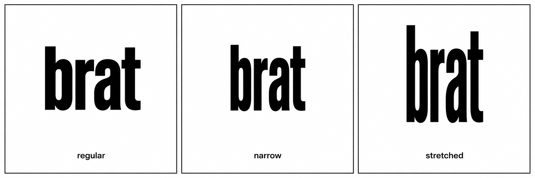
Sources disagree, and both answers can look almost the same. Stretching regular Arial taller makes it look condensed, which is why it is often mistaken for Arial Narrow. The safest description is “Arial-family, narrowed, lowercase.” Pick whichever gets you closest on your screen.
|
Arial |
Arial Narrow |
Stretched Arial |
|
|---|---|---|---|
|
Width |
Normal |
Condensed by design |
Normal letters, resized |
|
Letter shapes |
Original |
Redrawn narrow |
Distorted, thicker strokes look heavier |
|
Who names it |
Type archives |
Several generator sites |
Design blogs |
|
Best for |
Base of the look |
Quick match |
Closest to a stretched cover |
The disagreement is real. Treat any site that gives one answer as certain with caution.
Why Does the Brat Font Look Blurry?
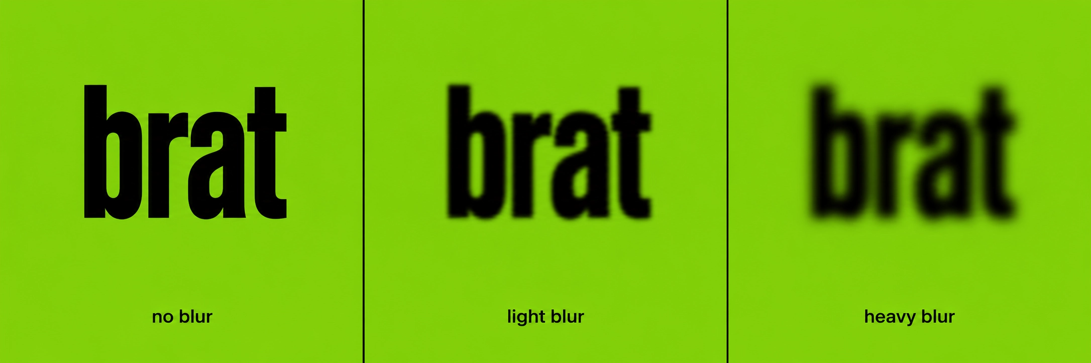
The softness is low resolution, not a normal blur filter. A designer involved in the artwork has said the cover was made small and then enlarged. Generators imitate that with a blur slider. Too much blur turns letters into smudges, so keep it light.
Need help with blur and export size? See the brat generator home page.
How Do You Recreate the Brat Font in Canva, Figma or Word?
Use lowercase Arial or Arial Narrow, make it look narrow and heavy, set a lime background (#8ACE00), use black text, then soften it slightly. Exact menus differ by app, so use the general steps below. BratGen Free does all of this in one step.
- Type your text in lowercase.
- Choose Arial or Arial Narrow, or your closest match.
- Make it bold-looking and narrower or taller.
- Tighten the letter spacing a little.
- Set the background to
#8ACE00and the text to black. - Soften the result with a small blur, or shrink then enlarge the export.
|
App |
Key idea |
|---|---|
|
Canva |
Use the closest Arial-family font; stretching may be limited |
|
Figma |
Scale the text box to narrow it; add a light layer blur |
|
Word / Google Docs |
Arial or Arial Narrow, lowercase, shape with green fill; no real blur |
|
BratGen Free |
Type, set blur, download |
Which Free Fonts Look Similar?
Free look-alikes get you close, but they are not the original. Arimo is designed to match Arial’s metrics, and Archivo Narrow is a free condensed sans-serif. Check each font’s license page before commercial use. Arial and Arial Narrow are licensed fonts, so avoid random download sites.
|
Font |
Where |
Note |
|---|---|---|
|
Google Fonts |
Arial-compatible spacing; open license |
|
|
Google Fonts |
Condensed; similar mood, not identical |
|
|
Arial / Arial Narrow |
Windows, Mac, Office |
Licensed; may be included with your system or Office |
Should You Download a “Brat Font”?
No. No official brat font file exists, so any “official download” is a red flag. Some pages offer look-alikes or unlicensed copies of commercial fonts. You don’t need a file: the look comes from settings, and BratGen Free makes the image without installing a font.
What Mistakes Ruin the Brat Font Look?
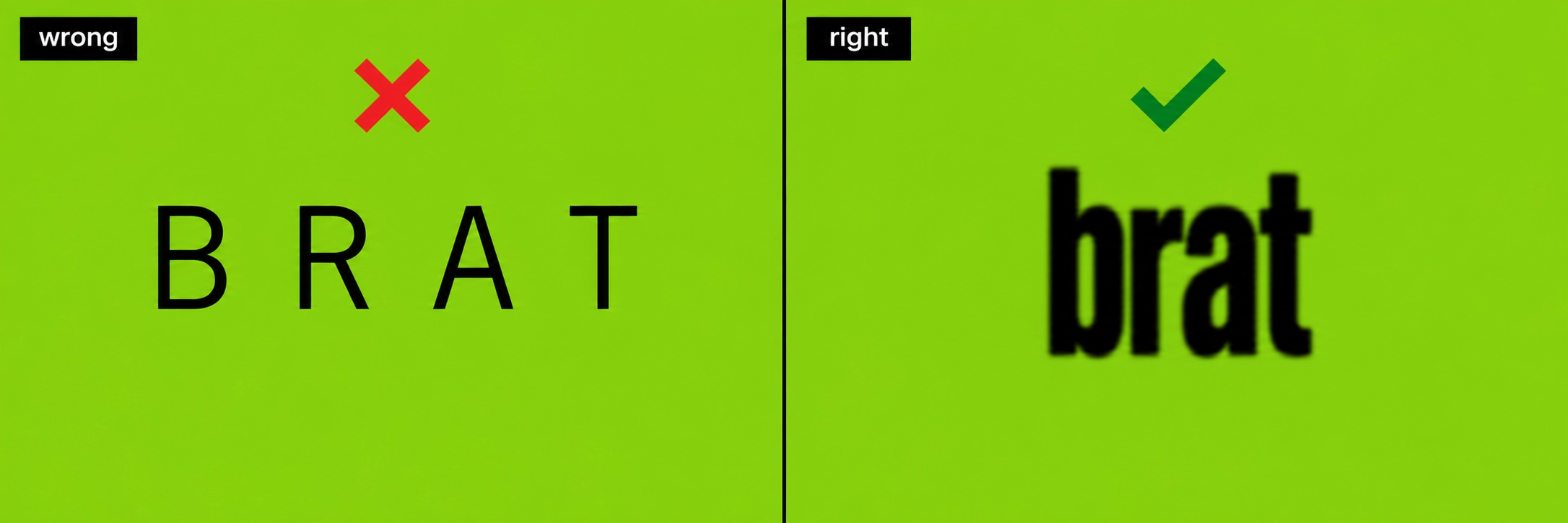
The main mistakes are uppercase text, a font that is too wide or too light, text that is too clean, wide letter spacing and hunting for a font instead of adjusting settings. Each makes the result look like ordinary poster type.
Brat Font FAQ
Is BratGen Free Private?
Yes. BratGen Free draws your text in your own browser, so it is not uploaded.
It is an independent fan-made tool inspired by the style associated with Charli XCX’s album Brat, and it is not affiliated with or endorsed by Charli XCX or her label.
More on the brat generator home page.
Read more: Fonts In Use: Brat album art · ABC Dinamo: font used for Brat · Wikipedia: Brat (album)
By the BratGen Free Team. Last updated September 2026. BratGen Free is a small, independent tool for making brat-style images in your browser, with no accounts or watermarks.